Tuesday, 29 May 2012

Evaluation of Clip

In comparison to the larger animations, ours is perhaps not as ambitious but it still flows smoothly and portrays the message intended. If given more time and a larger kitchen we could have developed it further, giving the gingerbread men a greater adventure or even making a larger army.

Ideally, if I had enough time and resources, I would have liked to have made a story that included perhaps a street of houses, probably because I like the idea of having a variety of house designs.

If we had made them out of clay, like the Nightmare Before Christmas, by Tim Burton, the characters would have been able to be more expressive and have more mobility, allowing us to be able to do more complicated sequences, therefore making the overall clip more interesting.

However, through making actual gingerbread men, George and I were able to enjoy ourselves in the creation of the characters and make our clip individual to those that are already out there.

And here is our outcome:


Title Menu

To make the overall outcome like a professional DVD, our tutor informed us about the program i-DVD. This software enabled us to add a title menu before the clip.

From its array of options George and I chose the projector theme for the title menu, feeling that it kept with the dated theme of our clip.

Monday, 28 May 2012

Final DVD Cover

Even though George was the one assembling this on her mac, I was an integral part of the decision making.

Final DVD cover

DVD Cover Development

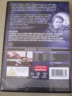
Looking to the previous images as inspiration, we instantly allocated jobs to one another. My first task was to write the blurb for the back of the case. I did so using another blurb as a template so that it would have realistic aspects while George took the measurements from the existing cover of the case (below):


Looking at the older film covers I looked for the necessary symbols on the internet (shown below) while George edited the photographs to act as stills on the back-cover and placed all the elements together; the both of us working on the overall layout:


DVD Cover Research Continued


DVD Cover Research

I was able to find some black and white films and sketches. However, the covers of the cases had been updated and digitally remastered so that the images were in colour, therefore not looking so dated.

The basic layout I found was having the leading actor/actress' name mentioned, followed by the title of the film and then a still image from the film with a simple or faded background.

The covers I looked at:


Wednesday, 23 May 2012

Designing the Screens


Placing all these elements together while using ‘The Kid Stakes’ screenshot as a template I was able to design the titles, information screens and the credits.

I used the screenshot on the left to base the credits on and the one on the right for the titles.


Screen Texture

Another choice we both agreed on was having a textured background over plain black. For our background we chose a picture of gingerbread, changing it to black and white in Photoshop and then changing the levels, making it dark enough for the text to stand out.

Font Search

Next was the type. They had particular fonts that were simplistic and serif. We preferred the ‘The Kid Stakes’ style apart from the chunky text for the title. Asking my tutor if he knew of any fonts that matched this style, he suggested Caslon, which ended up being the smaller font and title. After that we looked on dafont.com and found a suitable font called Sexsmith, which we thought had a great aesthetic in this environment.

Silent Film Research - Screens


At this point, we were nearly finished and while George was getting to grips with the software After Effects I took on the task of designing the information screens that would display the ingredients, oven temperature and cooking time.

Following on from Charlie Chaplin, I then looked at a couple of silent films, focusing on the screens rather than the overall theme, and found these examples: 


I also looked at Laurel Hardy (top right)and the films Cafe Elektric, The Kid Stakes, A Christmas Carol and The Cheat. Out of these options we preferred the ones in the corners because of the texture. another factor that attracted us was that even though they are simple they are not boring to the eye but easy to read with a complimentary range of fonts.

Looking at a couple of modern takes I found that that they either had a decorative border:


Or they were completely different, having no screens whatsoever but instead had the speech at the bottom and I know that I didn't want that because it seemed more like subtitles:


Choosing the Music

Since the clip is about gingerbread men, I assumed that the music needed would have to be light and fun, a piece that would leave you smiling. Unfortunately, I found that most of the tracks held pieces that were either mighty and loud, heavy and majestic or slow and sombre.
I was able to pick out a few pieces, but most still did not hold the right feeling:


At first I was looking for light sections within a piece, since I didn’t know how long it would be and assumed it would only be a few seconds. So, some pieces held great sections for the marching and others for the decorating sequence.

However, several came from Saint-Saëns ‘The Carnival of the Animals XII’. These pieces were shorter and each set their own mood.

Aquarium is more mystical as if something were being created.
Elephant is heavy and slow with light undertones.
Kangaroos is great for the decorating sequence but it is quiet and short.
Fossils is light and playful with a slow section in the middle but keeps upbeat.

Sections

The clips George made stopped each time we were going to introduce a screen of information, so, in total, she made around twelve miniature clips to form the complete stop motion.

Uploading the Images


When we uploaded some of the images, George placed them into i-stopmotion and when we played them back it skipped some frames and we found that this was due to the images being too large. So George started to resize them and when we both got our macs I resized the rest while George placed the ones already done into the program.

Filming Day - Friday 18th


Our aim was to finish the filming on this day, and thankfully we did, just in time. Since George had work, we only had the morning to do so. Most of the time we were making the army walk, which also took longer than expected, but in order to get everything done in time I did the sequence where they were marching across the screen whilst George decorated the house and applied the roof.


It got quite confusing but it worked out fine and soon the both of us were back to animating together. However, while taking the photos the house started to fall apart so it took a lot more time to support the roof without the camera seeing and ice the chocolate buttons on when they fell off.

Filming Day – Wednesday 16th


The first official day of filming the actual clip, George and I had high hopes for the day, wanting to get as much done as possible. Thankfully we both got a lot of work done, even though the progress was slow to start off with. We managed to get up to the waiting, about halfway, which, considering the set back of decorating the gingerbread men and getting the camera settings right, was quite far.

Before any images could be taken we needed to figure out the correct settings - Shutter Speed, F Stop and ISO.


In order to do the lighting we had to have 2 table lamps, one for each side, except the left one got in the way, so we had to make a tower for it to sit on.

After the stage had been set up, we needed to decorate all the larger gingerbread men, our cast, which took longer than expected because we had to pair them up with the various positions and then copy the design, matching the jelly tots and bow ties.

Other technicalities we came across we were able to fix. Such as, in order to lift the tray an appropriate height we needed to build another tower, so, we came up with the bowl and margarine, seeing that together they came to practically the same height as the larger gingerbread men.

Another was that when lifting the tray the gingerbread men couldn’t take the weight and kept falling, so, as a solution, George’s mum helped us to create the cardboard supports of which we glued the gingerbread men to so that they were supported enough.


In order to get the process finished quicker, George made the house that night, apart from the roof since an important decision needed to be made by the both of us. Now, we needed as many gaps as possible in order for the lights to get through, and thankfully George made a lot of windows, but George thought about adding roof lights, so, we added the two rectangles in each panel, adding crushed transparent mints in order to make a glass effect.

There was one gingerbread man in particular that was being awkward, and we named him Dodgy Dan. When I stood him up he fell, going off the counter and smashing on the ground. Both legs came off and one arm and even though we glued him back together he was still awkward to work with and rather fragile, since a leg in particular kept coming off.

Screens

So that we could see how many screens there were, resulting in how choppy the sections would become, I also drew out what each screen would say, and we discussed if the information would change and fade in or out so that there weren’t too many interruptions:

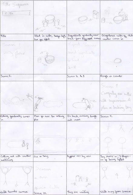
Updated Storyboard

Due to restrictions and problems, George and I had to make several changes to the storyline. For example, we decided to cut out the mixing and the men could not sit up so that sequence changed. Also, since we are going for the silent film theme we are going to incorporate screens, so, we changed the whole holding signs for ingredients idea.

Instead of having the gingerbread men raise from a tray we are having a screen that displays the title and the gingerbread men will begin by the bowl before walking off and then going into the ingredient sequence.

The scene of having a cutter was added in as well as the sequence of having the uncooked figures on the tray and lifting the tray up and lowering it.

However, we did decide against mixing the ingredients in the bowl and we cut out the original idea of showing the clock.
Because the sitting position wasn't perfected, we had to change the raising sequence slightly, just by raising them, which was done by spiking the back of their heads with cocktail sticks.

Also in the original there was going to be a side-view of them walking into the house, which we changed to a back view. And, the ending was completely thought through.

Tutorial Research - Nightmare Before Christmas


The Making of 'The Nightmare Before Christmas'
Part 1 of 3

 Part 2 of 3

Part 3 of 3

Tuesday, 15 May 2012

Tutorial Research

Having looked at the names from the notes taken, the mention of Wallace and Gromit made me think of one of my favourite directors, Tim Burton, who creates characters in a very similar way, using stop motion. This technique was used in the films Nightmare Before Christmas and Corpse Bride.

Other names that were associated to Wallace and Gromit were Morph and the original series of Postman Pat in the eighties.

Another program mentioned through the names of Bagpuss and the Clangers was Trumpton, another child series broadcasted in the eighties.

Group Tutorial - May 14th

In order to gain positive feedback and develop initial ideas, each member of the class had to show their blogs and explain their thought process so far. While George and I were at the front, Emily took these notes for us:


Contextual resources were given for the two of us to look into so that we could gain a better understanding on the technique. Looking into the techniques of early animation was also suggested.

Thought - Music

Since I have a collection of classical music, I could go through the collection and try to pick out relevant pieces, such as a slow piece getting faster for the creation and a lively piece for the marching, although, I don't know how to add them to the final piece.

Silent Film Research

I glanced at the website www.silentera.com and found many titles of silent films, as well as the cast and who directed. I was also able to view a still from each film but before looking into any of these names or titles I wanted to look into the first name that came to mind when silent film was mentioned.

And that is Charlie Chaplin. Here are a couple of clips I attained from Youtube:


Unfortunately, I completely forgot about the fact that in the background music is constantly playing to reflect the mood of the scene. Which means that if we want to follow this theme then we will have to find suitable music.

Thought - Silent Film

Neither George nor I thought of music to play in the background, so, I thought that in order to avoid this we could create a silent film effect, having the clip in black and white with frames of text interrupting, showing the ingredients and maybe at the beginning giving the title sequence.

However, I need to look into this a bit more in order to get a better grip on the idea.

Camera Workshop - 14th May

On the fourteenth our tutor gave us a workshop, explaining how we see images and, in particular, how an SLR works, aiding our understanding by drawing images and allowing us to handle the cameras to go through the settings and their effects on the outcomes.

Throughout this workshop I took these notes:

To start the workshop off, our tutor drew these images on the white board to explain how light and refraction works and to show how the cameras differed.

Here, an explanation of the common ISO speed was given, alongside the common Aperture settings and the range of Shutter Speed timings, and how these settings effected the outcome.

Light sources and the colours they show on the camera screen were explained, as well as the variety of modes on the camera.

Monday, 14 May 2012

Trial Day Clips - What We Learnt

George and I analyzed the clips, making these decisions about these particular sections:


We concluded that three of the five clips were fine - the only problems we found were that the swings were too large when making the initial four walk and that when the army were rising they did so too quickly so we need to fix these two problems.

Trial Day - Resulting Clips

5. Army walking across the screen

Trial Day - Resulting Clips

4. Army walking towards screen

Trial Day - Resulting Clips

3. Army Rising Up

Trial Day - Resulting Clips

2. Ingredients Being Pushed

Trial Day - Resulting Clips

Having placed the photographs in i-stopmotion, George created five short clips. What amazed me was how long it took to do each section to result in a few seconds of footage.

1.Larger walking across screen
 

Trial Day 9th May - What We Learnt

After shooting the trials, George and I looked through the photos on the camera to briefly see if these techniques were going to work and from looking through them learnt:


Before this stage, neither of us had really thought about the title sequence. When we thought that since the signs are popping up throughout the clip, why couldn't the gingerbread men be holding up our names and the title of the clip? We then thought about this idea further and to keep it simple we thought about postit notes and how they could peel off one by one rather than having the gingerbread moving, which would then mean doing a few sets in different positions.

Trial Day - Wednesday 9th May

Having baked most of the gingerbread men, George and I decided it would be a good idea to begin photographing, just to make sure that our storyline flowed. So, we chose certain sections from the storyline, outlining them in our To Do List:


To make it seem as if they were walking, we stuck bluetack to their feet, swinging them slightly, left foot then right.


In the clip we are going to have the gingerbread men pushing the ingredients, but for the sake of this tester we did it without, just so that we knew at what increments to push them forward each time, ensuring the result was smooth.

Since the sitting position was taken out, due to unsatisfactory results previously, I wanted to make sure that the other way of them standing – slowly rising while remaining in the standing position – was still smooth enough.


Once they rise from the tray there is a clip of the army walking towards the camera, an aspect we wanted to try out.


Finally, because they walk differently to the larger gingerbread men, we wanted to see how the army looked. This took up the majority of our time because of the large amount of switches. It went from the left leg being forward, to them standing still, to the right foot and then still once again. Not only were there a large number of switches, the distance they travelled was minimal, so that requires even more work, after all we would like them to cross the whole screen.