Tuesday, 29 May 2012

Evaluation of Clip

In comparison to the larger animations, ours is perhaps not as ambitious but it still flows smoothly and portrays the message intended. If given more time and a larger kitchen we could have developed it further, giving the gingerbread men a greater adventure or even making a larger army.

Ideally, if I had enough time and resources, I would have liked to have made a story that included perhaps a street of houses, probably because I like the idea of having a variety of house designs.

If we had made them out of clay, like the Nightmare Before Christmas, by Tim Burton, the characters would have been able to be more expressive and have more mobility, allowing us to be able to do more complicated sequences, therefore making the overall clip more interesting.

However, through making actual gingerbread men, George and I were able to enjoy ourselves in the creation of the characters and make our clip individual to those that are already out there.

And here is our outcome:


Title Menu

To make the overall outcome like a professional DVD, our tutor informed us about the program i-DVD. This software enabled us to add a title menu before the clip.

From its array of options George and I chose the projector theme for the title menu, feeling that it kept with the dated theme of our clip.

Monday, 28 May 2012

Final DVD Cover

Even though George was the one assembling this on her mac, I was an integral part of the decision making.

Final DVD cover

DVD Cover Development

Looking to the previous images as inspiration, we instantly allocated jobs to one another. My first task was to write the blurb for the back of the case. I did so using another blurb as a template so that it would have realistic aspects while George took the measurements from the existing cover of the case (below):


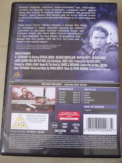
Looking at the older film covers I looked for the necessary symbols on the internet (shown below) while George edited the photographs to act as stills on the back-cover and placed all the elements together; the both of us working on the overall layout:


DVD Cover Research Continued


DVD Cover Research

I was able to find some black and white films and sketches. However, the covers of the cases had been updated and digitally remastered so that the images were in colour, therefore not looking so dated.

The basic layout I found was having the leading actor/actress' name mentioned, followed by the title of the film and then a still image from the film with a simple or faded background.

The covers I looked at:


Wednesday, 23 May 2012

Designing the Screens


Placing all these elements together while using ‘The Kid Stakes’ screenshot as a template I was able to design the titles, information screens and the credits.

I used the screenshot on the left to base the credits on and the one on the right for the titles.